UX Design /
Barron's NEXT
2018
Experience Design
Mobile/Web UI
System Design

Overview
Barron’s NEXT is an online investing publication for the Millennials audience, but it hasn't optimized its usability for its target users since the product launch. I reviewed the usability of Barron’s NEXT onboarding and explore new features in order to redesign the Barron’s NEXT experience as a class practice project with Barron's company.
Design Process

Challenges

How might we optimize the reading experience in investing better for the Millennials to save time and effort?

User Research


Target:
-
Ages 23-37
-
Has investing experience
-
Employed full-time (30 or more hours per week)
-
Income $80k - $150k+
-
Currently or has previously invested in a publicly-traded stock
Problems & User needs:

Figure 1: Original user flow & problems
-
Users are unable to find a company/stock to invest in quickly and easily because users have to click in one article and read the whole article to find a company.
-
Users can hardly find important information since the sections are not organized well on the home page. E.g. the starter Kit section is on the bottom.
-
Users need to spend too much time to find a specific stock.
-
Users might get lost in the investing process since some buttons and pages didn’t allow users to go back.
-
There is no filtering tool or comparison tool for users to research further.

Figure 2: Designed new user flow
To solve the problems, I simplified the process of finding a stock after reviewing users needs and re-structuring the sitemap. Also, I added three features based on Persona and User research in order to save the investor's time and effort.
Main features
Feature 1: Quick link of stock symbol
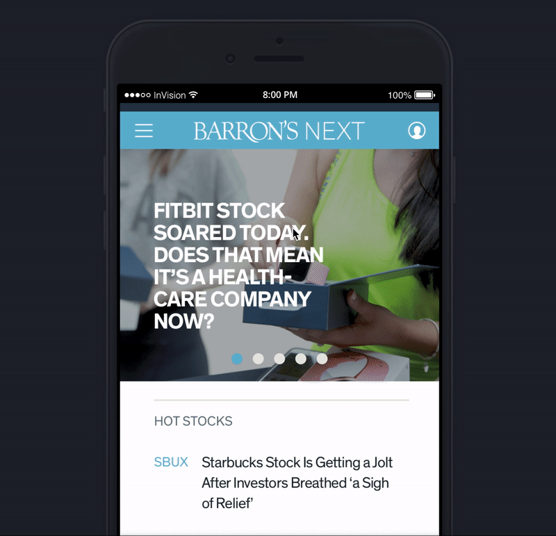
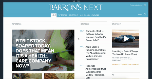
Figure 3: Quick link of stock symbol
on the homepage
On the market, each stock has a specific symbol. For example, Starbucks’s symbol is “SBUX” and Apple’s symbol is “AAPL”. They are highly identifiable. I added them as a quick link on the homepage so that users do not need to click into one article to search for one specific stock info.
Feature 2: Section titles and Photographic Categories
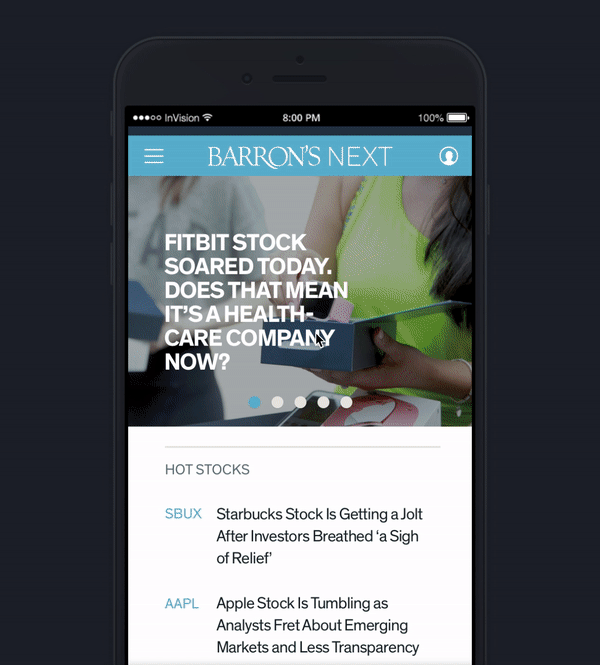

Figure 4: Photographic categories
on the homepage
I organized the sections, for example, I moved “the starter kit” to the front part of the home page and gave a title to each section so that users will not be confused. I created photographic categories so that users can easily understand each category and reach them fast.
Feature 3: Tags of articles for further research
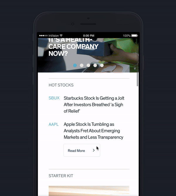

Figure 5: Tags of articles for further research on the inner page.
I added tags on article lists so that users are able to filter articles and find what they are interested in easily.
Prototype

Clickable prototype (mobile): https://invis.io/G5PLYY7HXRZ
Clickable prototype (website): https://invis.io/RQPLYYYY6TZ
Design Style Guide
Including: Components, Color setup, Buttons, Form & Input elements, Typography


